Needless to say, co-hosting the fourth hour of the Today Show was a thrill beyond words! Here’s a closer look at the cottage transformation Jenna Bush and I talk about.
Here’s the backstory… a couple of years ago we – that is, my partner Dennis and I – came across a house on a lake in the Poconos that looked every bit like a diamond in the rough. A manageable size, cute details, and get this – it was right next door to our own cottage. It was a three bedroom, two bath right on the water, about 90 minutes from NYC for around $150,000.
Just to set the scene – a house on a quiet lake! Peaceful! Serene! This lake right here!
After years sitting vacant, it finally went on the market. Weekend after weekend, we watched as people walked in, took a look, and abruptly left – quickly – every time. (You see, we actually have the house RIGHT next to it. We stared at this house, seeing it would make a lovely rental, full time, or even a retirement home. We couldn’t wait to see it for ourselves. The inside was stuck in a time warp!
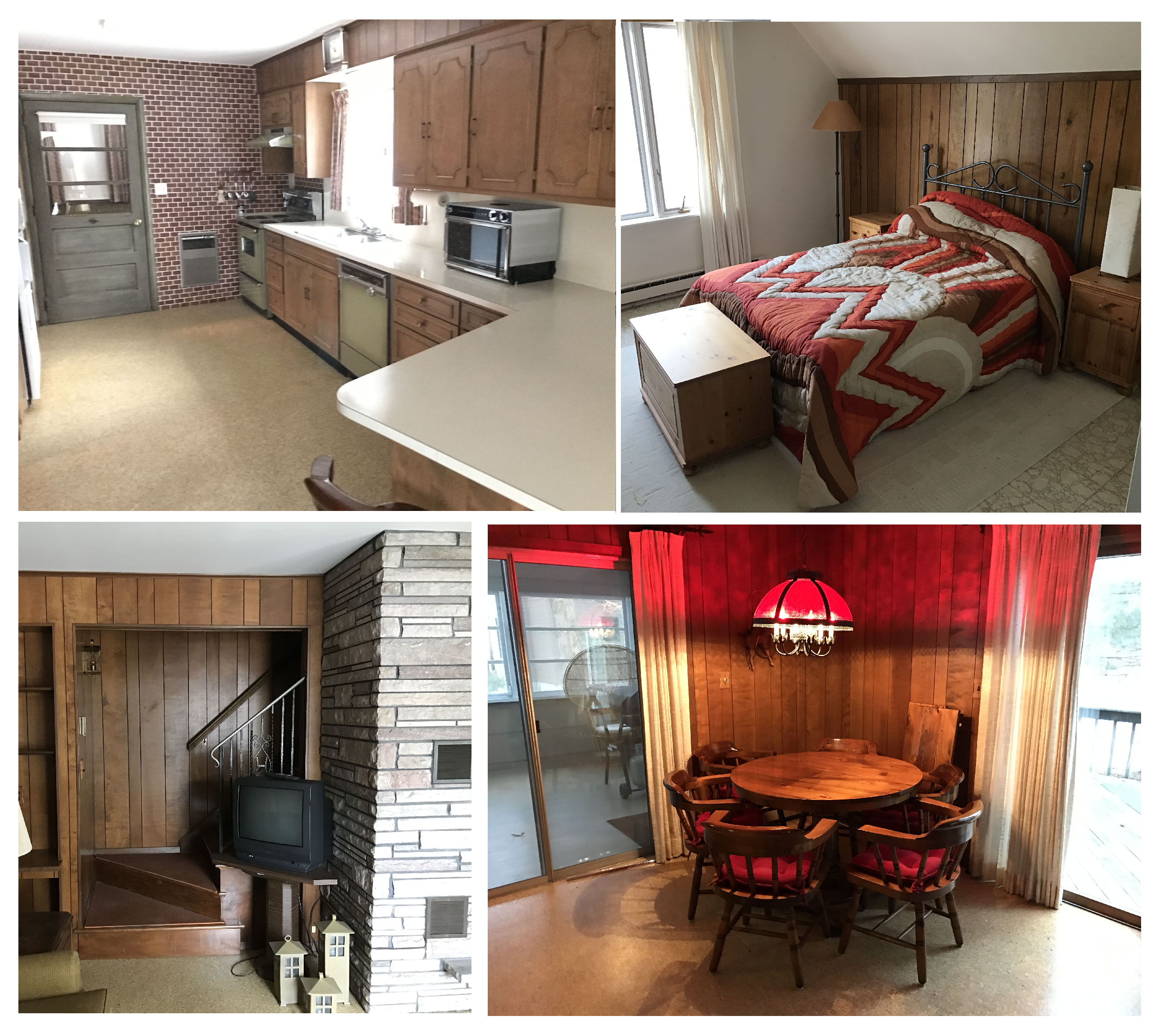
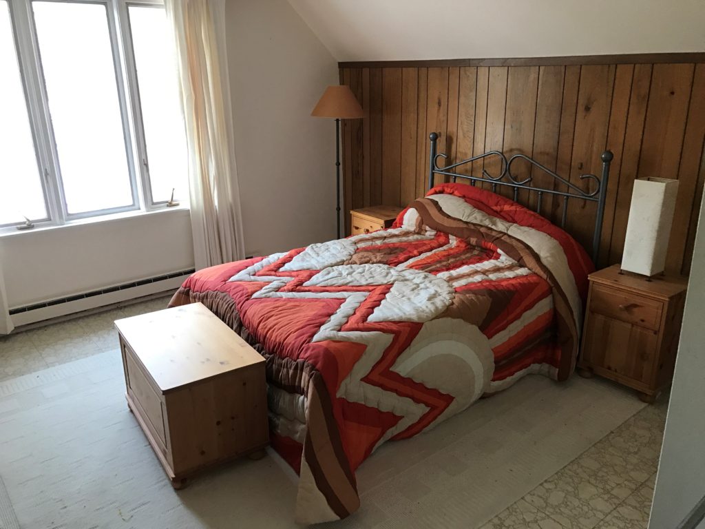
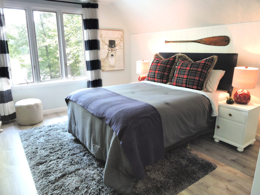
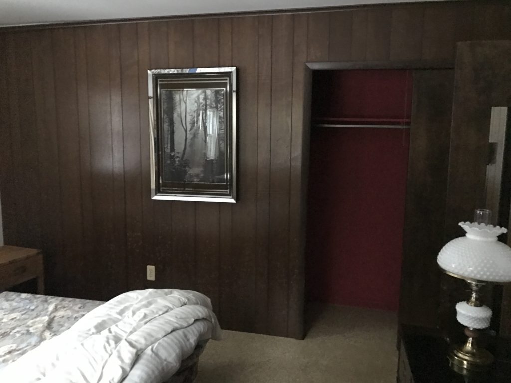
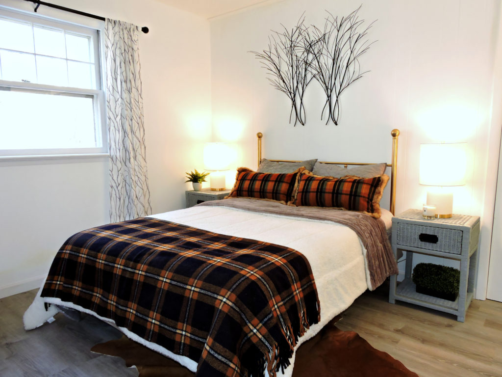
CHECK OUT THESE BEFORE PHOTOS! CLICK THE RIGHT ARROWS TO SEE THE AFTERS!
We saw a lot of paneling – a lot of old finishes, and a LOT of POTENTIAL!
Since there wasn’t a lot of structural work to be done, we wanted to paint and SAVE as much as possible.
Let’s walk through it!
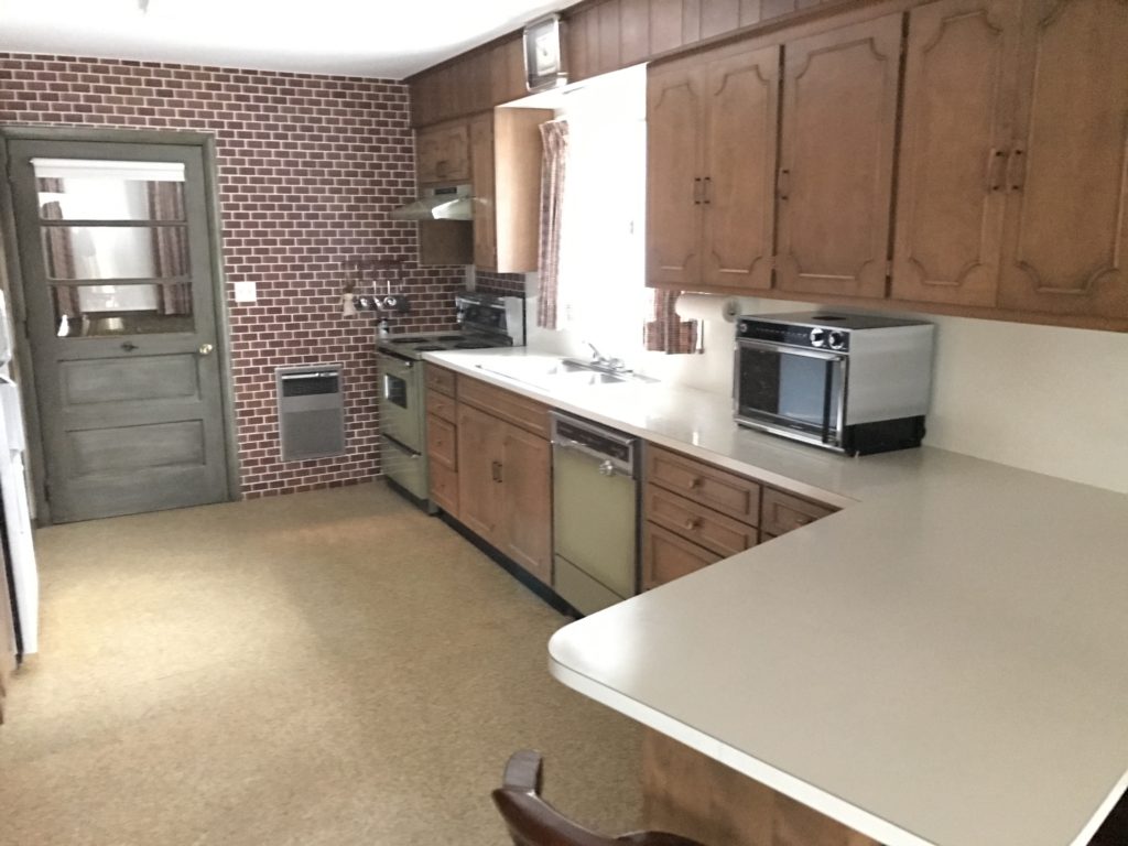
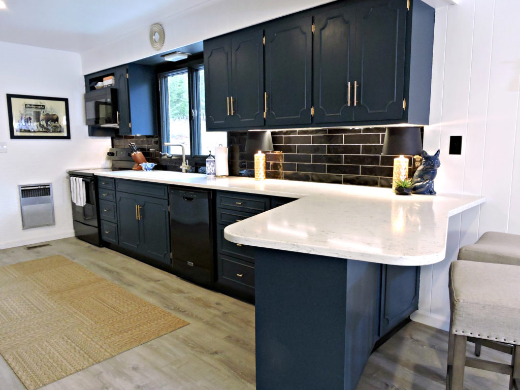
Let’s start with the kitchen… click through the photo gallery to see the afters and then scroll down for more!
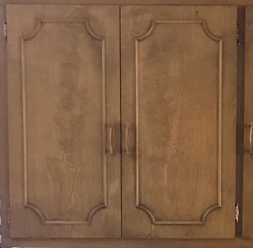
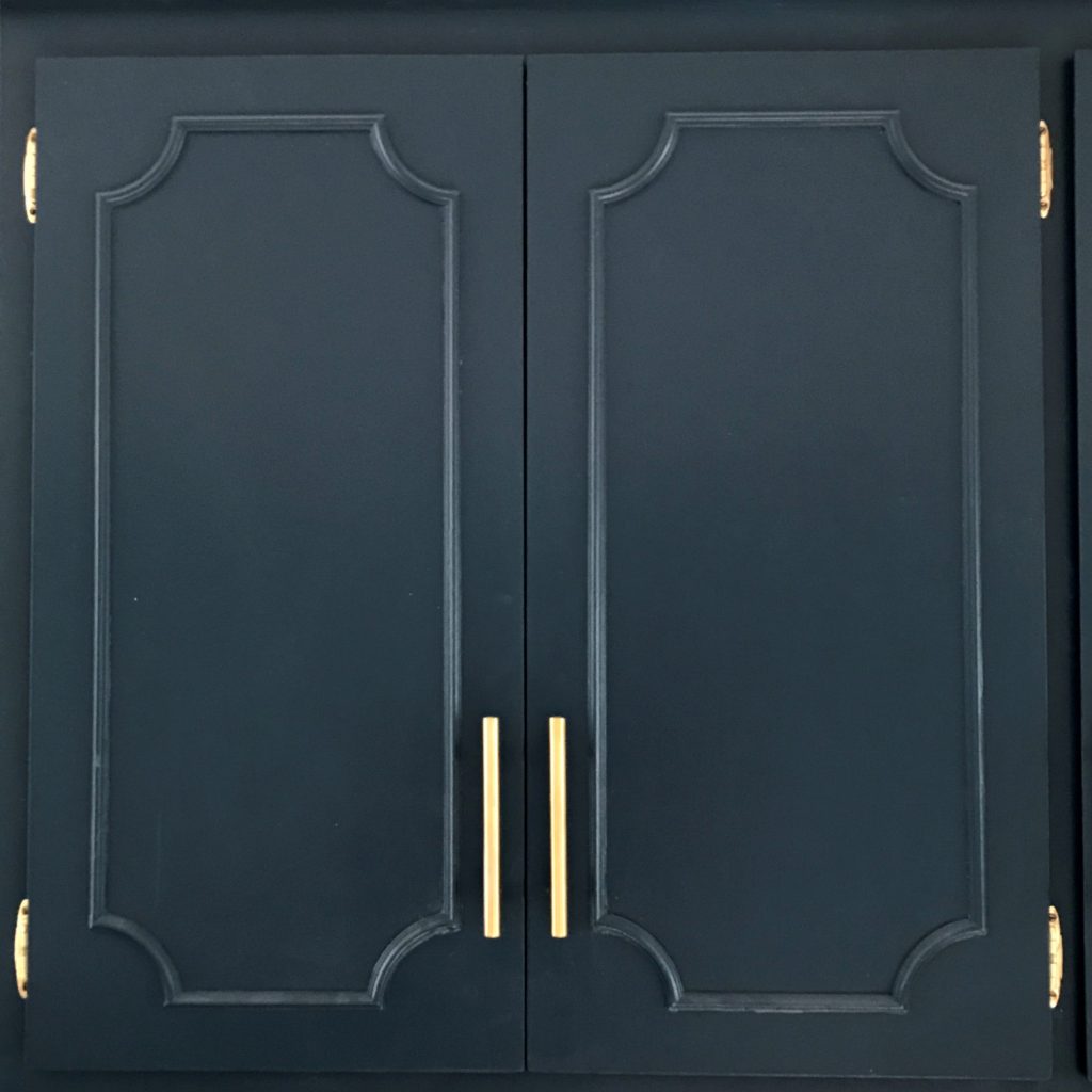
We couldn’t wait to get our hands on the kitchen. The cabinets were in great shape – solid wood, nice detail, the perfect candidate for a coat of paint. That wall in the back that looks like brick? It’s actually a rusty-colored ceramic tile, and it needed to go. To save demo time, not to mention money on new sheetrock, we just painted it a semi-gloss white. We wanted to try something different from the current trend of white subway tile on the backsplash and try something different, aiming for black subway tile (still one of the most affordable you can buy) and dark grey grout. New brass hardware from Amazon was a nice, affordable cosmetic fix. Quartz countertops were the biggest investment in the space. (Note the floors, which we installed throughout, are laminate wood-look flooring – extremely durable and perfect for a lake where lots of dirty feet will be tracking through.)
Okay – moving on to the eating area…
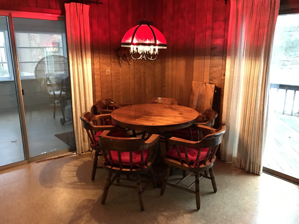
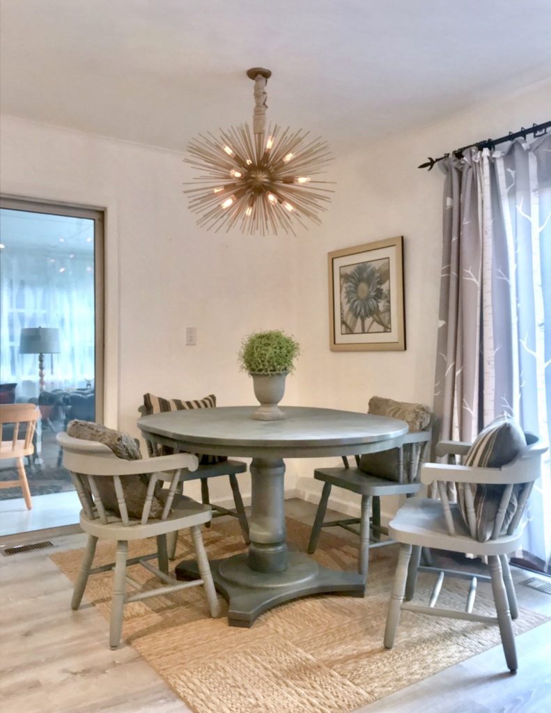
For the eating area, the paneling, just like all the other paneling in the house, was painted a crisp white. It was the table and chairs that we decided to tackle. We used Montana Gold Spray paint in “Shark Grey” (yes, even though it’s called ‘gold’ it comes in a gazillion shades). It’s used by graffiti artists because it comes in beautiful, unusual shades (five different grays alone!) The best part is the way it covers – it goes on so evenly, without the dripping and running you see in spray paint you buy at hardware stores. (Yes, we sanded first.)
On to the bedrooms!
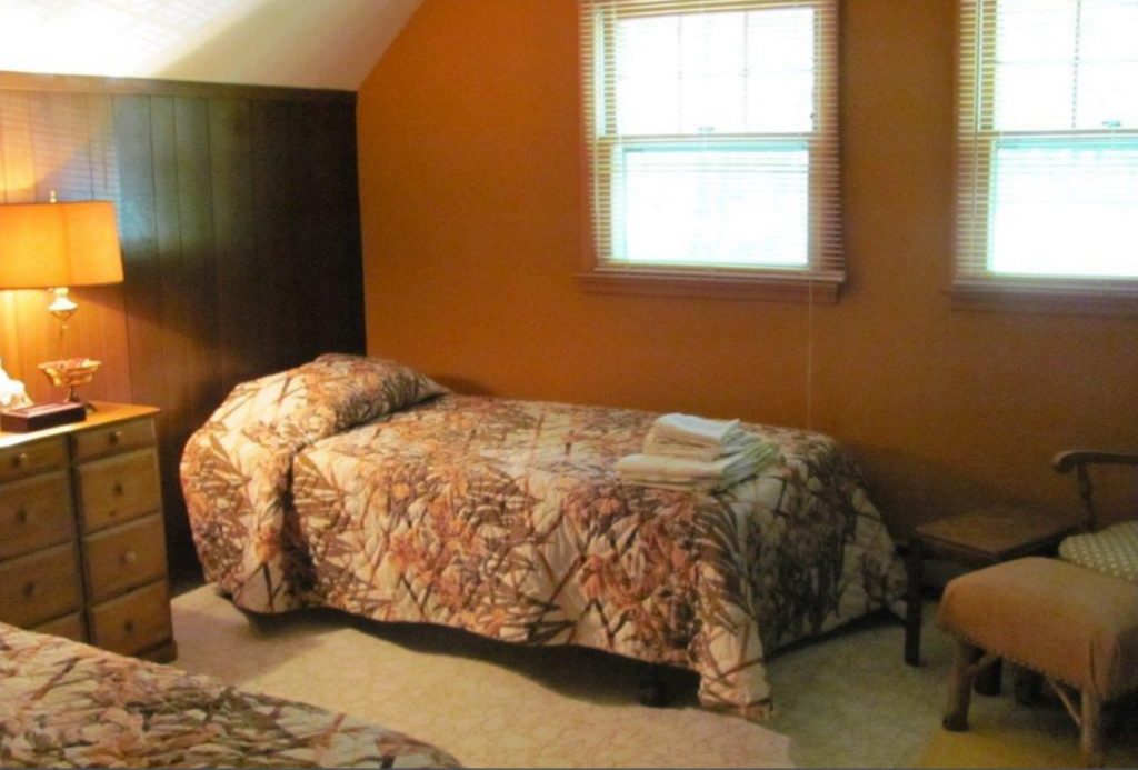
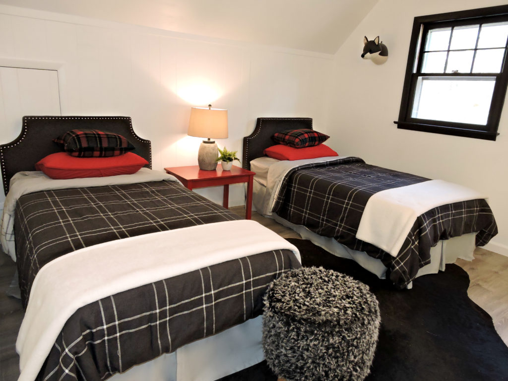
For the bedrooms, we really wanted to maximize ‘bang for your buck’ by using whatever we could that was left in the house. All the paneling again was painting a semi gloss white, and new laminate wood-look flooring was laid throughout. In the case of the master, the wood side tables were painted white and new hardware was added. The metal headboard was painted gold and moved downstairs, where we took the dated wicker side tables that had been left behind and painted them shark gray. From there we headed to Homegoods and TJ Maxx for accessories, blankets, pillows and more. (Yes, we did get new mattresses.) Could we have done more? Sure, but the idea of this cabin rental is that it would be simple and easy to maintain, plus with people coming in and out we wanted to keep some of the extra accessories to a minimum, knowing anything too precious wouldn’t survives the wear and tear.
Next up, the sunroom!
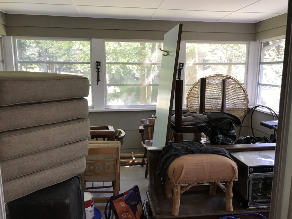
The sun room was a completely forgotten area. Painted the same color as the building’s exterior when we bought it, it needed to be brighter and HAPPIER!
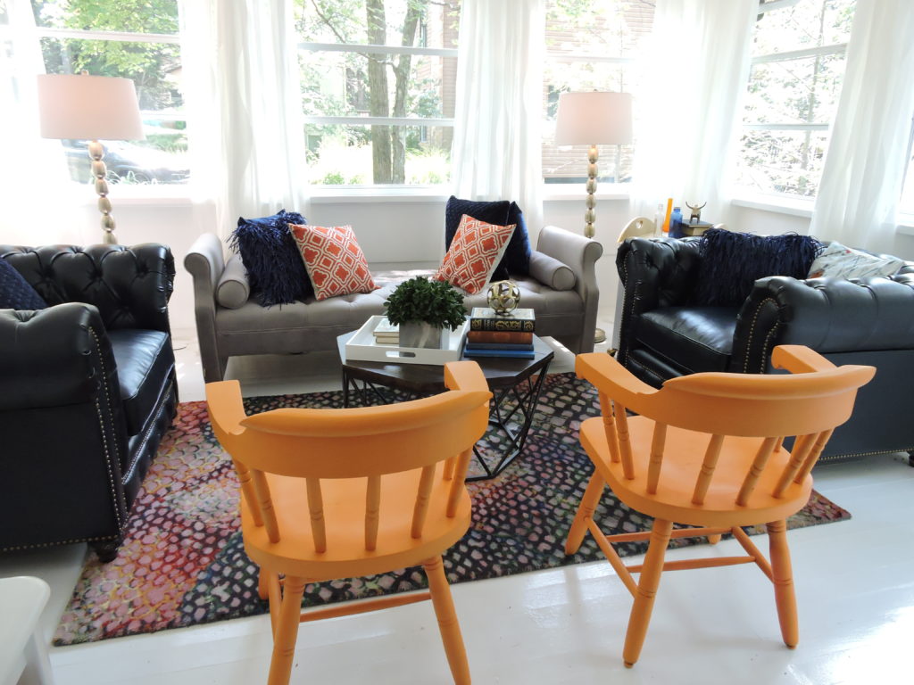
We ended up going with a colorful, really eclectic mix of pieces – for a couple of reasons. One, we had some blue chesterfield chairs that we had ordered online, and they were HUGE. Too big for the living room. So they had to go somewhere. There were also a couple of captains chairs left over from the dining room table that we wanted to have nearby, but not always have at the table itself. Since the rooms are adjacent to each other, this seemed like a perfect place. A tangerine orange was speaking to us. We really love orange, but to do an entire dining table and chair set might have been too much – even for us. We love the result. I realize this look isn’t for everyone, but I do like the idea of secondary or smaller spaces being where you do more experimentation with color. Did I mention that we painted every inch of the place white? What a difference in the light alone! This is a happy room. I would love to fill it with plants, but since we don’t live here, they would die pretty quickly… so this is what we’re working with!
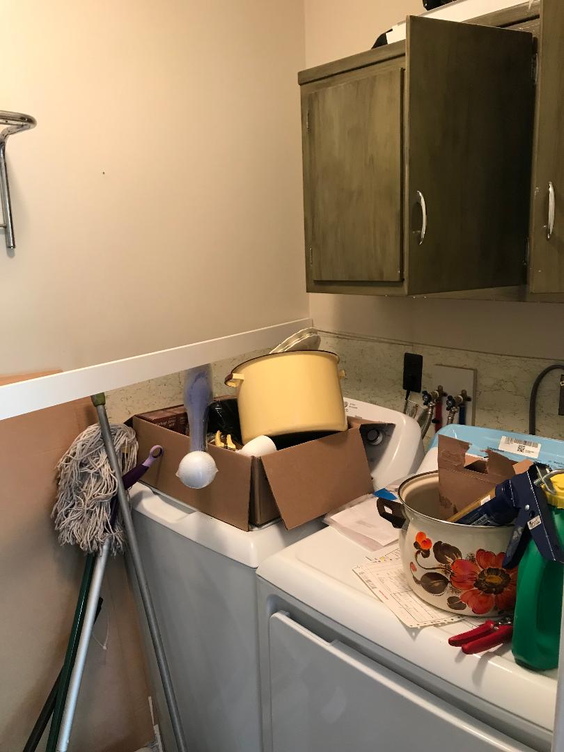
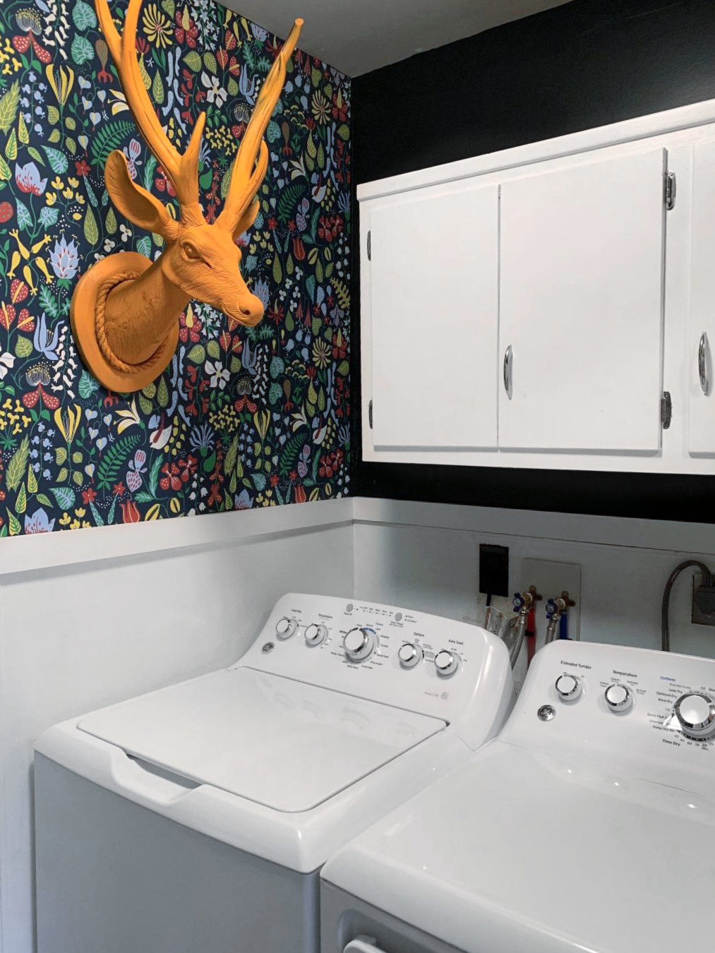
Speaking of bold spaces – let’s check out the laundry room!
As I was saying earlier, I love taking a small room like a bathroom, or in this case a laundry room, and making some bolder choices. I mean, a laundry room can be a depressing place! Not this one. When you go in here, you NOTICE. It socks you in the face with pattern and color. Navy blue paint on all the walls but one is covered in a wildly colorful wallpaper print. This might be too much on all the walls (although I would have been fine with it – and might still do it someday.) The cabinets are brighter in a semi-gloss white. I added a piece of trim to the middle of the wall to separate it and give the wallpaper a break. This also saves a bit of money since you pay for wallpaper by the square foot and you just call your coverage in half! The same tangerine paint from the sunroom went on the faux buck head.
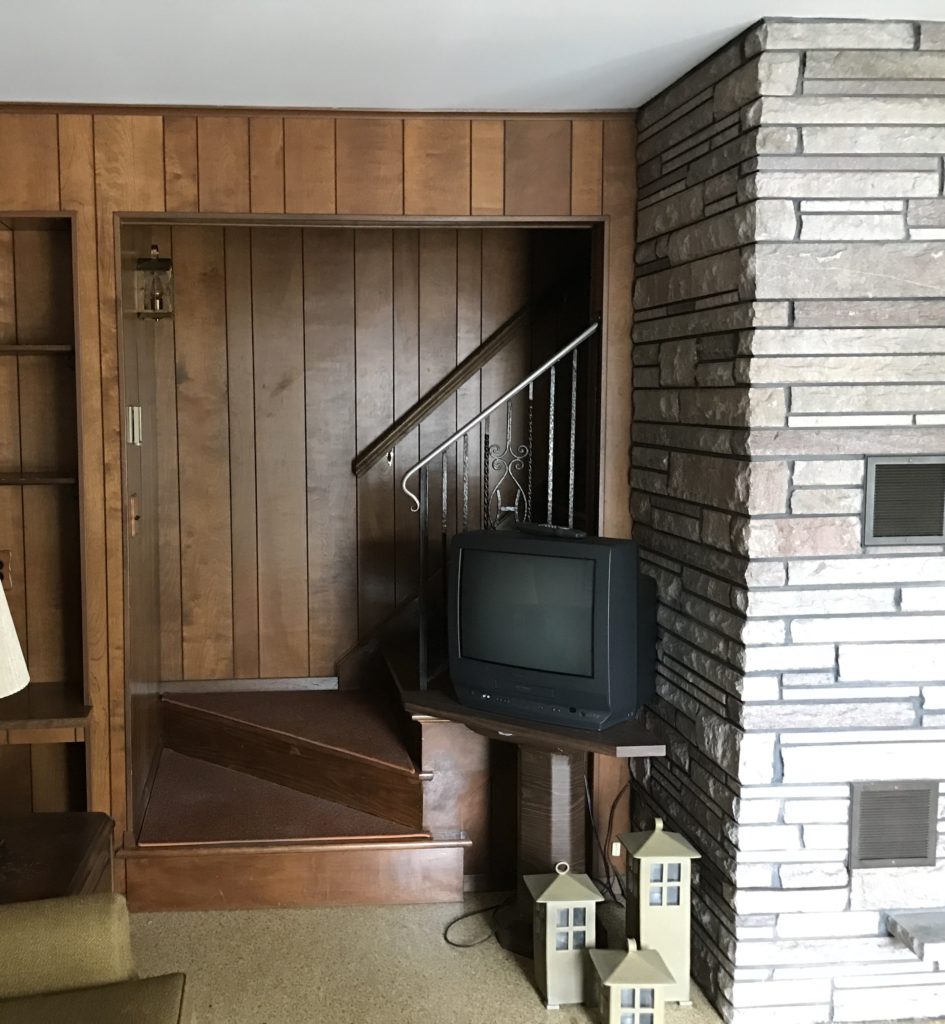
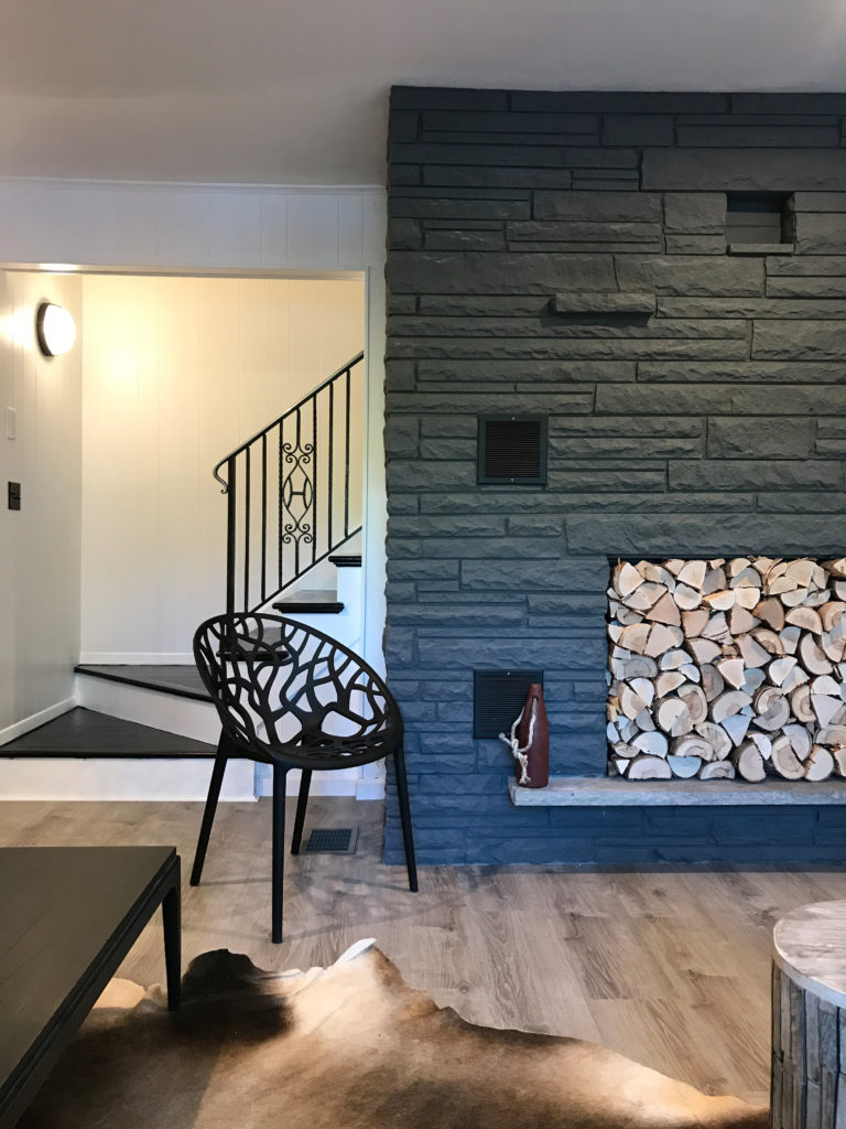
For the stairwell and the fireplace, again, paint came to the rescue! Paint everywhere you look!
Yes, we did paint the stone of the fireplace, which had pink stones that made it feel dated. We closed up the fireplace temporarily, cutting pieces of firewood to lengths between four and six inches and attached them to a piece of black firewood to make it appear as though they run all the way through the back of the chimney! And get this – even the firewood was left behind the previous owners. We tried not to waste a thing! A few pieces were need to fill the gaps but nearly all of it came from inside the house itself!
Let’s head outside!
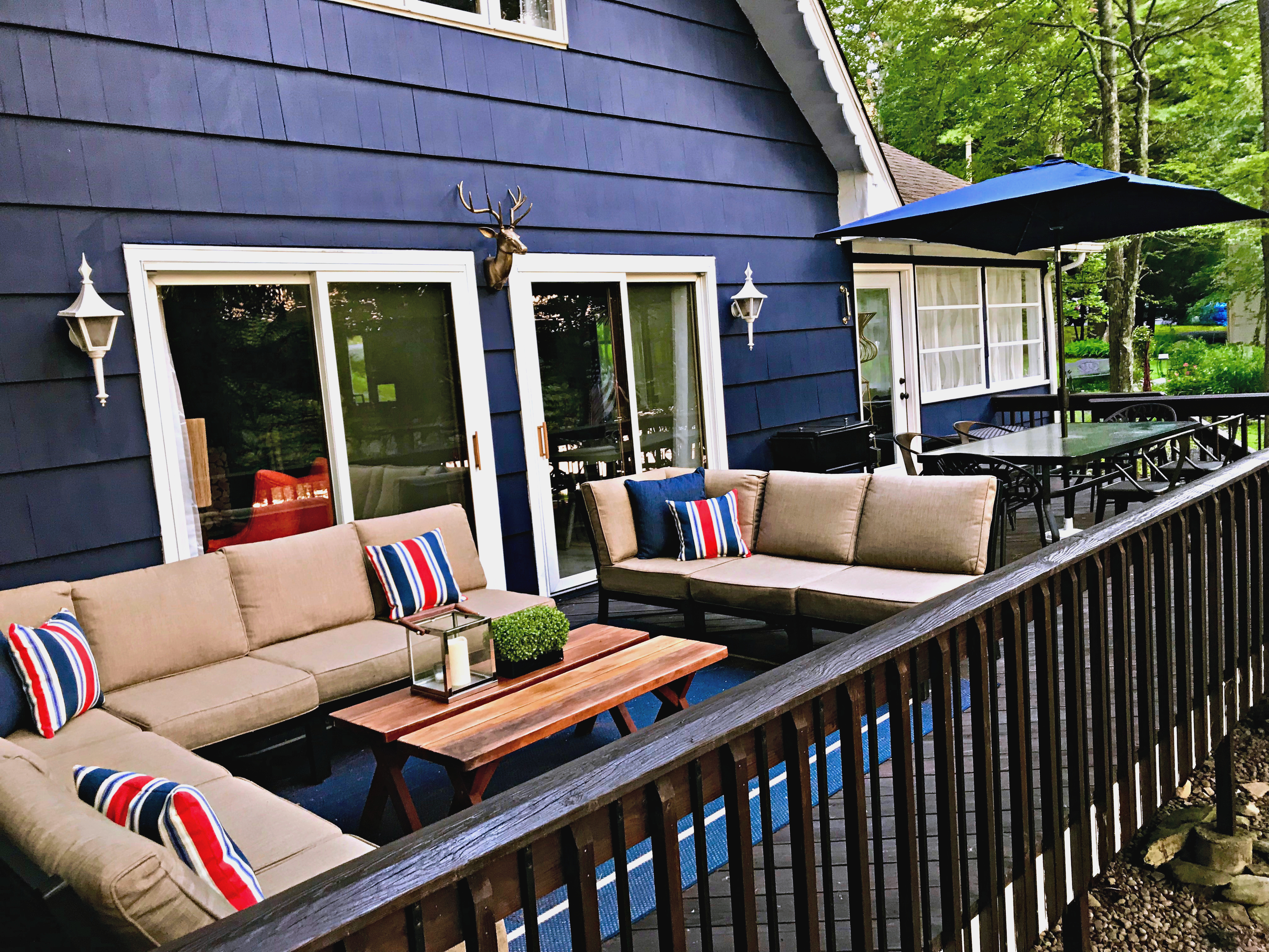
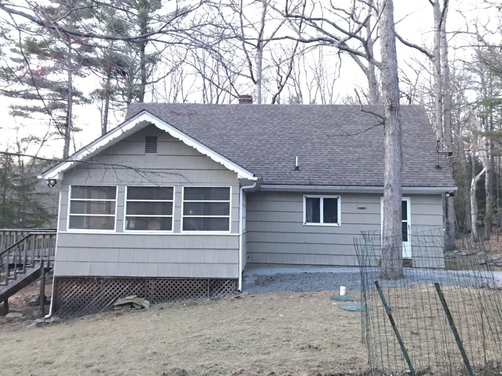
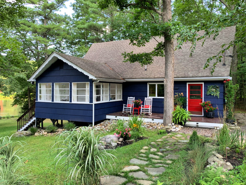
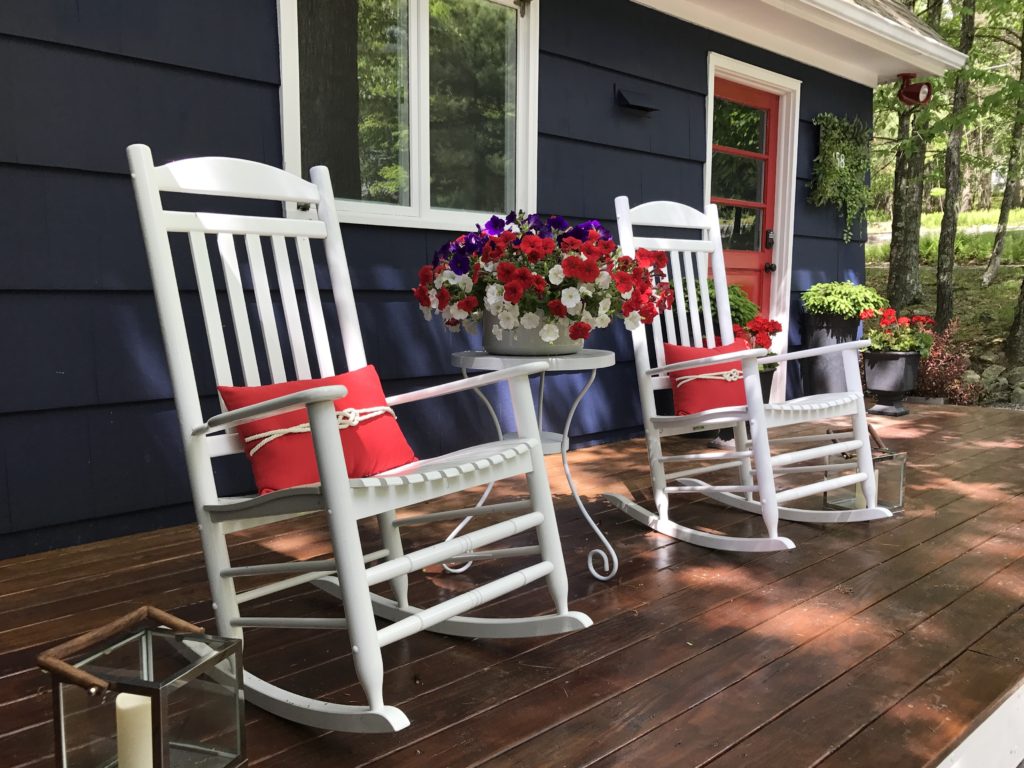
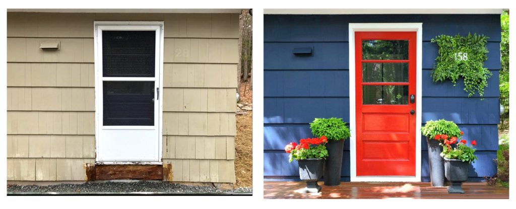
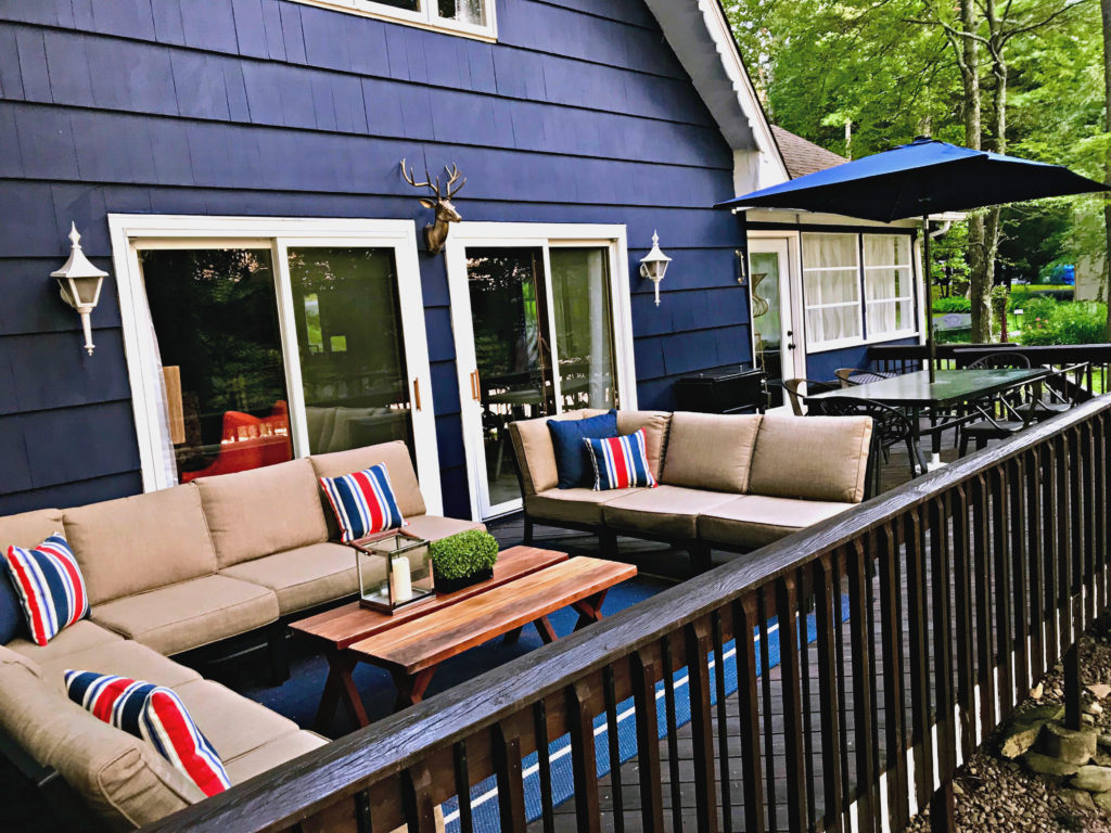
Doing the outside was SO. MUCH. FUN. I scoured through the internet to find house exteriors that I loved. We knew we wanted something happy. My partner Dennis wanted a floating platform deck, which really was a great idea that brings the house to a more contemporary realm. Navy Blue, actually the name “Old Navy,” by Benjamin Moore, was the color we chose, with a truly fire engine red door. I’ve shown a before after of the doorway just to demonstrate just how dramatic the change was. The yard was so much fun to put together. We gathered stones from the yard for that pathway. I’m obsessed with working with stone, (who ever would have thought I would find that to be so fun?) so I have probably worked on five pathways around the house. I love how it gives the place a quaint cottage feel. For the record, the deck has never been as clean as it was the day after we stained it. Leaves are constantly falling, branches and dirt flying. It’s maddening. I’m glad we have this picture because it may never look this amazing again! LOL.
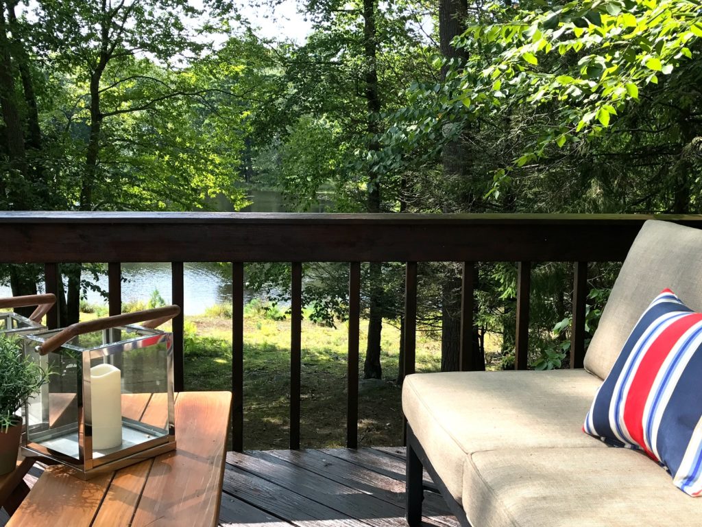
Let’s go to the deck that faces the lake!
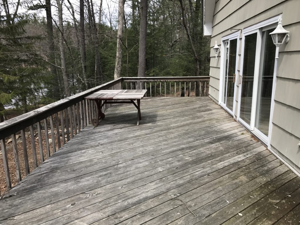
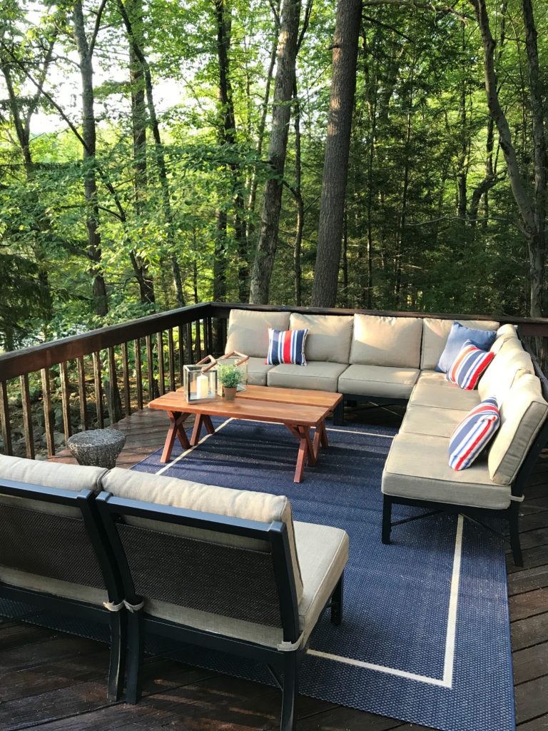
I thought this deck was going to be a write-off. Turns out it just needed a wash-off. Powerwashing the deck – carefully, that is – if you don’t do it with careful caution you can rip up chunks of wood – brought it back to life. Stain and some discounted outdoor furniture transformed it! The best thing that could have happened was that we waited until about August to do this – which means outdoor furniture in the area was on sale, and in the case of one of these sets, already put together, since it was a floor model. We ended up saving more than a thousand dollars on this weather resistant furniture simply due to when we bought it.
So…
There is actually still some house left to show you – but I wanted to get through this much – so you could have a look! I welcome your thoughts and feedback, and thank you so much for checking it out!


